
Share This Article
Numbers and statistics are everywhere, yet they rarely capture attention or inspire action. Piktochart solves this persistent problem by enabling anyone to transform raw data into beautiful, compelling infographics without requiring design skills or expensive software. In an age where visual content dominates communication, this platform empowers marketers, educators, journalists and business professionals to tell stories that matter. This comprehensive guide explores how it revolutionizes data visualization and why it’s become the go-to tool for creators who refuse to bore their audiences with dull presentations.
The Power of Visual Storytelling in Modern Communication
Research consistently shows that visual content is processed faster and remembered longer than text alone. This reality drives the explosive growth of its across industries. Whether you’re presenting quarterly results to executives, teaching complex concepts to students or sharing research findings with the public, thiss communicate with clarity and impact. Before modern solutions, creating professional visualizations required hiring expensive designers or learning complicated software that took months to master. Piktochart changed this equation by democratizing design and making sophisticated visual communication available to professionals of all technical skill levels. The platform recognizes that great communication doesn’t require great design experience.
Intuitive Design Interface That Empowers Non-Designers
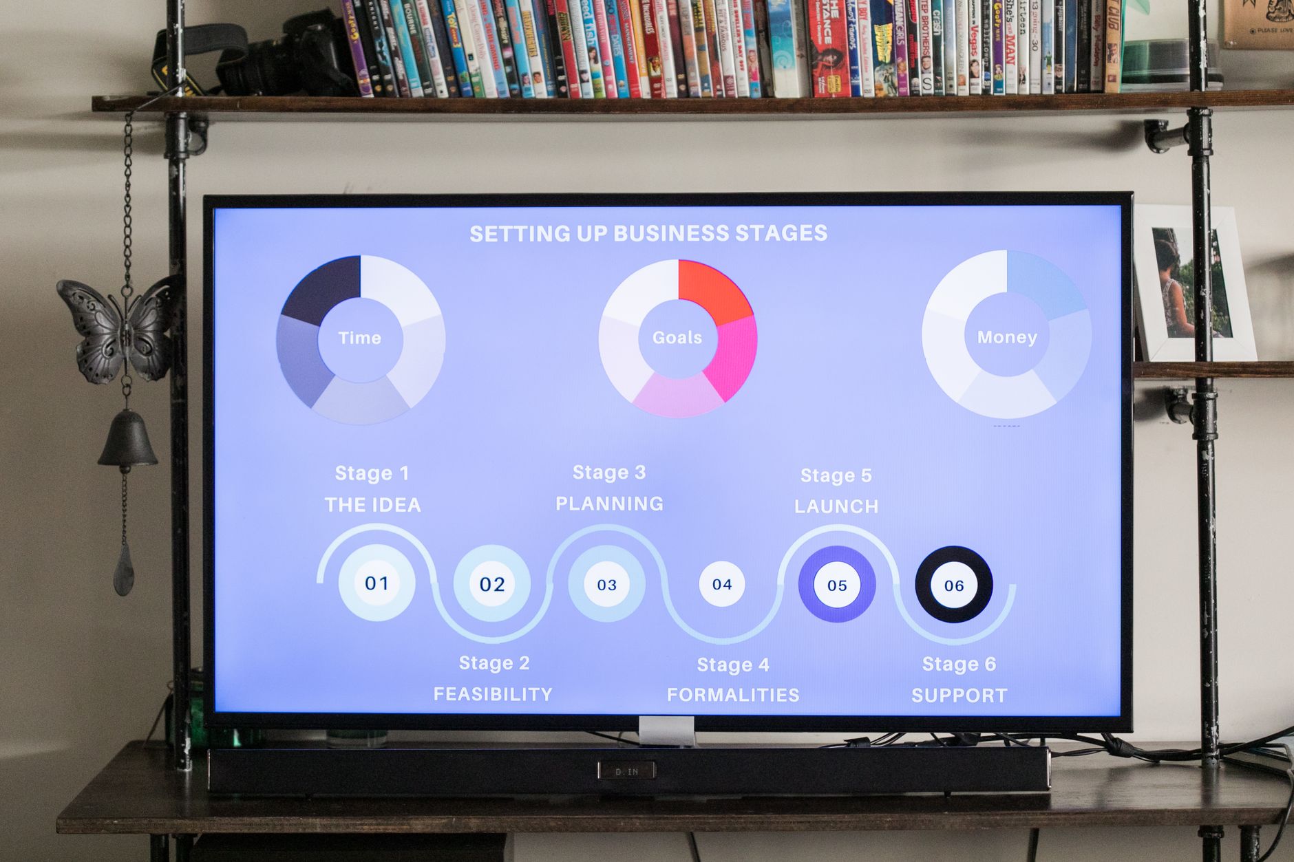
Piktochart‘s strength lies in its remarkably intuitive drag-and-drop interface that removes friction from creation. Upload your data, select from hundreds of professionally designed templates and customize colors, fonts and layouts to match your brand instantly. The platform guides you through each step with helpful suggestions and real-time previews showing exactly how your infographic will appear. No design background necessary. No steep learning curve. Templates cover every imaginable use case market analysis, survey results, research data, social media statistics and presentation decks. Each template is pre-optimized for visual hierarchy and readability across devices. Whether you’re creating a simple bar chart or a complex multi-section it, the interface responds to your needs without overwhelming you with unnecessary options or features.
Powerful Data Integration and Flexibility
The platform handles data in multiple formats, accepting uploads from Excel, CSV, Google Sheets and manual entry. This flexibility means you can work with data from virtually any source without tedious reformatting. Update your this when numbers change, your visualizations remain consistent while data automatically refreshes in real time. It supports numerous chart types including bar charts, pie charts, line graphs, heat maps and custom visualizations. Advanced users can layer multiple data sets and create complex narratives through individual it sections. The balance between simplicity and power makes the tool suitable for beginners creating first infographics and professionals managing elaborate data visualization projects with demanding stakeholders.
Templates Designed by Professional Designers
The platform boasts a constantly expanding library of templates created by experienced designers who understand visual communication principles. Each template follows contemporary design principles while ensuring readability across devices and viewing contexts. Color schemes are carefully selected to evoke appropriate emotions and maintain visual harmony throughout the entire composition. Typography choices enhance legibility without sacrificing aesthetic appeal or modern design sensibilities. Spacing and composition guide viewers’ eyes through your data in logical sequence, creating narrative flow. You can start with a template and customize it extensively to match your brand or use templates as inspiration for your unique creations. This designer-first approach ensures your thiss look professional regardless of your personal design experience.
Sharing and Distribution Made Simple
Piktochart its can be downloaded as high-resolution images, embedded in websites, shared directly to social media or exported as interactive web elements. This distribution flexibility means your visualizations reach audiences wherever they spend time consuming content. Social media optimization ensures your infographics display beautifully on every platform from mobile to desktop. Email-friendly formats make sharing with stakeholders effortless and professional. Website embeddings include tracking capabilities so you can monitor engagement and understand audience response. The seamless sharing workflow removes barriers between creation and distribution, allowing your message to reach audiences quickly and effectively with minimal technical friction.
Collaboration Features for Team Environments

Teams benefit from collaboration tools that enable multiple users to work on projects simultaneously without version control nightmares. Comment on specific elements, request revisions and track changes throughout the creation process. Share projects with colleagues who can view, edit or provide feedback depending on permission settings. This collaborative approach streamlines workflows in marketing departments, research teams and content agencies handling numerous concurrent projects. Prevent duplicate work and ensure consistent branding across all company thiss through shared templates. Real-time updates mean everyone stays aligned as projects evolve. The communication features built into the platform reduce email threads and scattered feedback, keeping all input centralized and organized in one accessible location.
Extensive Brand Customization and Consistency
The platform allows detailed brand customization through color palettes, font selections, logo uploads and custom backgrounds. Create brand guidelines that apply automatically to all new its, ensuring visual consistency across your entire organization. Save custom templates for repeated use, maintaining brand standards while speeding creation time for future projects. This brand-centric approach appeals to companies managing multiple communication channels and demanding consistent visual identity. Whether you’re a Fortune 500 company or a creative startup, the tool adapts to your branding needs and organizational standards. Teams using these features report significantly faster production cycles and more cohesive visual communication strategies.
- Create stunning infographics in minutes without design experience or expensive software costs
- Support for multiple data formats including Excel, CSV and Google Sheets integration
- Hundreds of professionally designed templates covering every industry and use case
- Seamless sharing across social media, websites, email and presentations for maximum reach
- Collaboration features enabling teams to work together efficiently on visual projects
Stop settling for bland presentations and forgettable data visualizations that fail to engage audiences. Piktochart transforms your information into compelling visual stories that engage, inspire and drive action from your audiences every single time.