Share This Article
Text can either sit quietly on a design or completely shape how the design feels. Think about a logo, a poster headline, or even the title on a product label. The letters themselves carry mood. Some look confident. Others feel playful, refined, or bold. The difference rarely comes from the font alone. It comes from how the lettering is shaped, spaced, and integrated into the layout. This is where many design tools fall short. They offer text boxes, a font menu, and little else. Amadine approaches typography differently. Instead of treating text as a secondary feature, it gives designers tools that allow letters to behave like real vector shapes, opening the door to much more expressive typography.
Why lettering plays such a big role in visual design
Typography is often the first thing people notice in a design, even if they do not realize it consciously. A headline can feel energetic or calm depending on its spacing and structure, and brand identity frequently depends on these small visual cues. Within Amadine, lettering becomes more than just typing words on a canvas. Designers can work with text as a visual element that interacts with shapes, layouts, and composition. This approach matters because typography frequently carries the emotional tone of a design. A travel poster, for example, might use loose, spacious lettering to create a sense of openness, while a luxury brand may rely on elegant, tightly controlled typography. By allowing text to behave as part of the vector artwork itself, Amadine gives designers the freedom to experiment with these moods rather than settling for default formatting.
Turning text into editable vector shapes
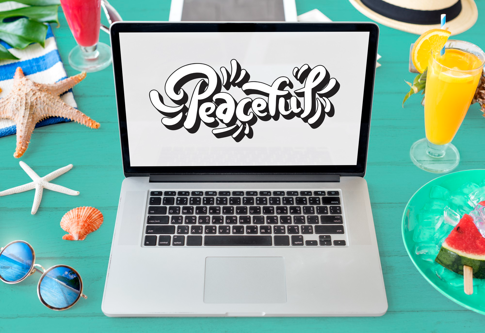
One feature that designers quickly appreciate in Amadine is the ability to convert text into fully editable vector paths. At first glance this may sound technical, but the idea is simple: once letters become shapes, they can be reshaped just like any other graphic object. A curve in a letter can be adjusted slightly, a serif can be refined, or an entire word can be stretched and balanced visually across a design. Many professional logo designers rely on this process because standard fonts rarely match the exact personality a brand needs. In Amadine, that transformation happens smoothly, allowing users to move from typing text to sculpting lettering without switching tools or disrupting the layout.
Using typography as a creative illustration element
Lettering sometimes moves beyond typography and becomes illustration. Posters, album covers, and packaging often feature decorative lettering where the text itself becomes part of the artwork. Because Amadine works entirely within a vector environment, designers can easily combine lettering with shapes, gradients, and paths. Text can follow curved lines, wrap around circular layouts, or integrate with graphic elements that surround it. A simple headline might evolve into a visual centerpiece once color, shape, and scale come into play. Many designers enjoy experimenting with this kind of creative lettering because it blends typography with illustration. In Amadine, that transition happens naturally since both text and graphics live within the same flexible vector workspace.
Designing logos and brand identities with custom lettering
Brand identity often depends heavily on typography. A company name displayed in the right style can instantly communicate personality, whether that personality feels modern, traditional, playful, or sophisticated. Designers working on branding projects often start with a font but rarely end there. Instead, they reshape letters, adjust spacing, and refine details until the wordmark feels distinctive. This is exactly the type of workflow where Amadine proves useful. By allowing text to become editable shapes, designers can craft lettering that feels tailored rather than generic. A small curve adjustment or alignment change might be enough to turn an ordinary font into a recognizable logo style. Over time, these refinements are what make branding visuals memorable.
Why typography tools matter in everyday design work
Even outside of branding projects, typography affects almost every design task. Social media graphics, posters, presentations, and digital advertisements all rely on text to communicate ideas quickly. When typography tools are limited, designers often spend extra time trying to work around restrictions. Platforms like Amadine remove some of that friction by allowing text to behave like a flexible design element from the start. Designers can move between lettering adjustments and graphic editing without leaving the same workspace. That fluid workflow often leads to more experimentation, which is usually where the most interesting design ideas appear.
The value of typography freedom in a vector design tool
Designers tend to judge tools based on how easily ideas can move from imagination to screen. Typography plays a surprisingly large role in that process because text is rarely static. Words change size, alignment, spacing, and sometimes even shape as the design evolves. Amadine supports that creative process by giving users the freedom to treat lettering as part of the artwork itself. Rather than locking text into rigid formatting rules, the platform allows letters to adapt and grow with the design. For creators who enjoy exploring typography and custom lettering, that flexibility can make the difference between a design that simply works and one that truly stands out.